Photos and detailed property information in the real estate industry are one of the best marketing tools. Unfortunately, the obvious is not that obvious. Home sellers, property agents, and brokers who think that –since they use online platforms selling property listings is not a problem – should really think twice.
There are thousands and thousands of property listings being posted every day. If your listing does not compare well enough with the others, then clearly how you do it has to improve.
Here are the ten things that make an online property listing look terrible and what you can do to improve them.
1. Using an unappealing main photo
The main photo should be the best image of your listing. This is what the buyers see first and what makes your listing stand out from the other properties on the list. So make sure it invites prospective buyers to click on it.
A strong main photo for a condo or an apartment is an interior shot, with warm and soft lighting that displays the nicest looking space, typically the living room area, dining area, or the bedroom. For a house, a color calibrated exterior shot of the front which includes perhaps a lovingly maintained garden, pool, or parking space.
It doesn’t have to be taken by a professional photographer, nor do you need to have an expensive camera (though that’ll be great if you do). A smartphone and a good photo editing app will do. For laymen, this easy guide is useful while pros may want to check this out.
2. Too few photos
While privacy is always an important factor to consider, uploading just one or two photos doesn’t exactly persuade buyers to consider your listing. It’s not necessary to take pictures of every corner as a few good ones tastefully done will whet the buyer’s appetite for a viewing.
Preferably upload at least five (5) images. Use a mix of exterior and interior shots, with the ratio leaning heavily towards the latter. You may also want to include photos of the amenities if they add to the value of your listing.
3. Darkly lit interiors
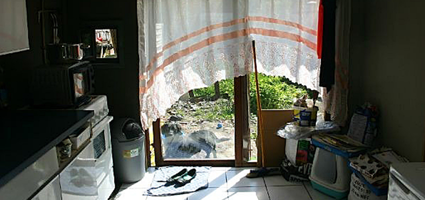
The worst you can do with dark lit interior shots is to make your listing look like a still from a horror movie. While darkly lit interiors may not be that bad at all, making the extra effort to use warm and soft lighting is definitely much better. Try to experiment using different shutter speeds and apertures to take good indoor photos with an off-camera flash. Here’s a guide on learning when and when not to use flash.
4. Small, low-res, or blurry photos

This is an immediate turn-off for a listing. Online property portals are optimized to showcase a listing’s photo gallery. Using ridiculously small, low-res, or blurry images for your online listing means you already lose half the battle for the buyer’s attention.
5. Wrong orientation
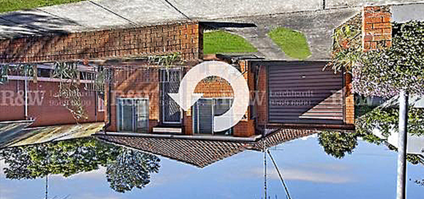
You don’t want to give your buyers a stiff neck trying to figure out how the photos go the right way up, isn’t it? Then don’t be careless. Take the time to see how your listings show up on the platform you’re using. If necessary, contact support to ask how to fix the orientation of your listing images.
6. Strange decorative pieces
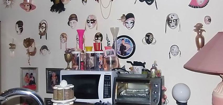
Unless your property is tastefully decorated by a professional or you use the showroom unit for its images, refrain from adding decorative pieces that may turn off buyers. They may have a hard time separating their impression of the property itself with the strange decorative pieces that don’t come with it.
7. Personal items
De-cluttering also applies to personal items. While you may think that your humongous collection of dolls look interesting, it may look spooky to some. Also exclude personal hygiene items in the shower, toilet, and washroom. Don’t leave cleaning materials lying around, either.
8. People
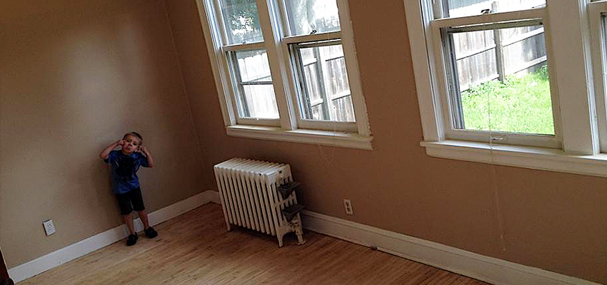
Unless they come with the property itself, kindly leave out people in your listing images. This includes kids, househelp, and the photographer.
9. Animals
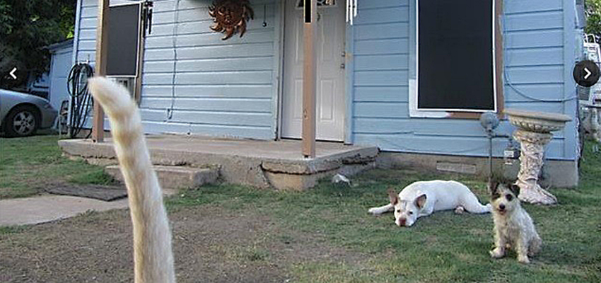
Ditto with domestic pets. Yes, they look terribly cute but you might be leaving out non-pet lovers from your pool of potential buyers.
10. Incomplete property information
Great! Your listing images look superb. Complement it with complete property information. You don’t have to be Shakespeare to describe how awesome your listing is. Rely on the images for that.
Just make sure the essentials are provided:
- The number of bedrooms and bathrooms;
- the floor and or lot area;
- the furnishing type: unfurnished/semi-furnished/fully-furnished;
- the parking type
- the name of the residential building (if it’s a condo or apartment);
- the address;
- the ownership details.
Feel free to include details that make the property even more interesting, such as views to a golf course, the building’s amenities, or the city skyline.
Have other ideas to make online property listings better? Share them with us by commenting below!


